Website & Packaging Design

818
BREWING.
ROLE
TIMELINE
TOOLS
Art direction and designer
Adobe Illustrator & Figma
5 weeks
818 Brewing is a microbrewery and testing room established in 2014 in Canoga Park. They offer a variety of local craft brewers' styles such as light, IPAs, amber/red, and dark.
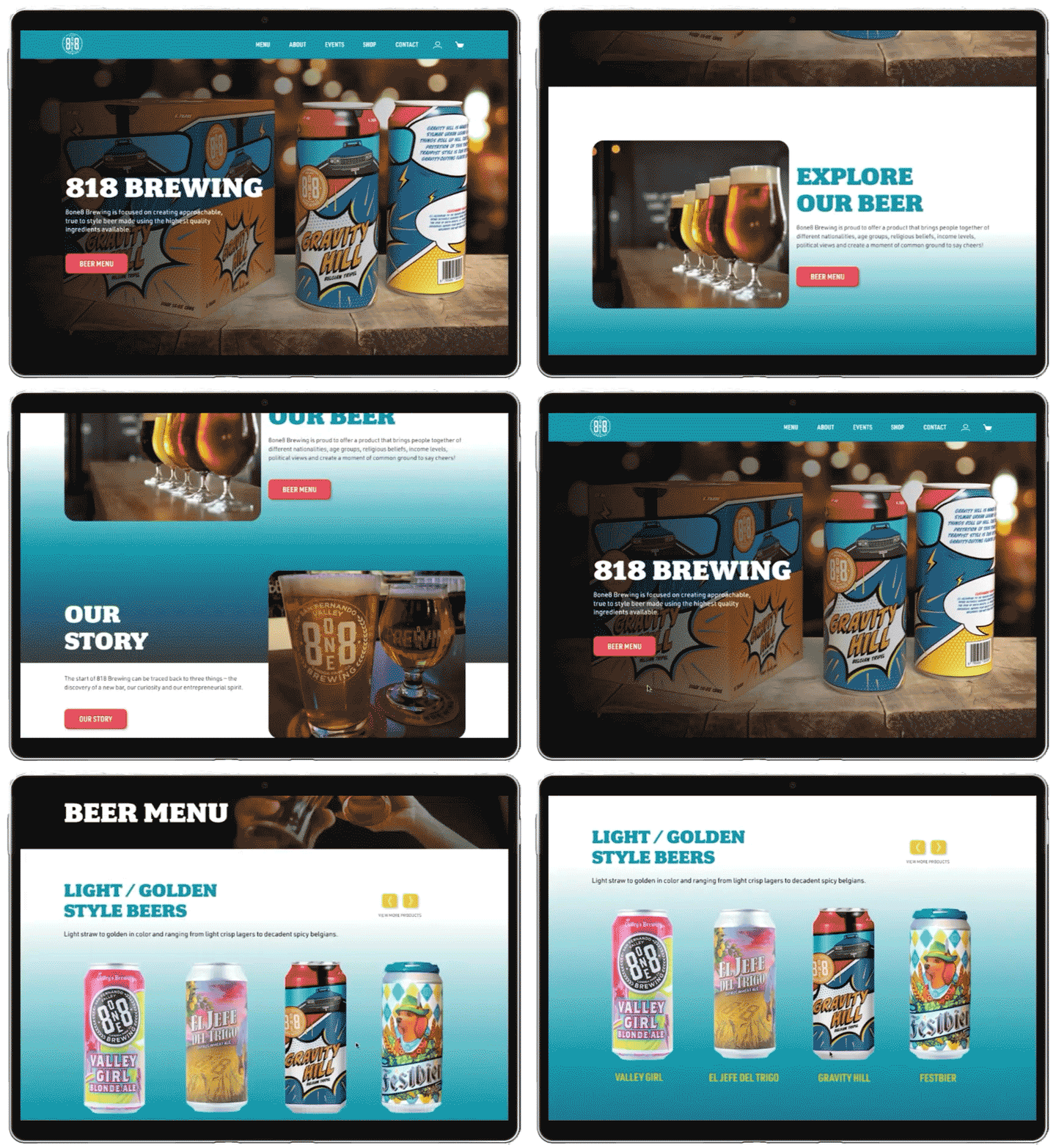
The project consists of two components. In the first part, a can and box for 818 Brewing's Belgian Tripel beer named Gravity Hill were designed, utilizing the pre-existing 818 Brewing logo. The second part of the project entailed redesigning the company's website.
PART 1:
PACKAGING DESIGN.
PACKAGING STYLEBOARD.
The concept is inspired by the bold and colorful style of pop art.

SKETCHES.
In the sketches, elements of pop art were incorporated, with a focus on car references. This was done to align with the theme of the beer, Gravity Hill, which pertains to an optical illusion that creates the illusion of an uphill slope on a slight downhill incline.


CONCEPT.
The color palette and typeface used reference the pop art style.
COLOR PALETTE.

#ED3B3B
#CE202B
#528FCB
#1B64AC
#FFCE35
#F8983A
TYPEFACE..

BOX PRODUCTION.

BOX & CAN PACKAGING.

PART 2:
WEB DESIGN.
CURRENT WEBSITE
UX/UI AUDIT.
1.
Have a footer with relevant information and some important links, instead of having a secondary nav bar at the bottom.
2.
The website could break up the text to improve readability and to allow stand out the most important information.
3.
There are too many pages that have just a little content. This could be avoided by restructuring the pages and the content.
4.
Some pages have extra steps that could be avoided. For example, eliminating some buttons and placing the information on just one page.
5.
All the pages have the same layout, a hero image, and the rest of the information below it. All the secondary pages could have a smaller hero to make them look different from the landing page.
6.
The majority of the images are only placed at the top of the pages as hero images. Placing images in other parts of the pages can help break up the text and make the site more interesting.
PERSONAS.
To gain a deeper understanding of user needs and preferences, two personas were developed. These personas were created to provide insight into how users would engage with the product.

RYAN
34 years old
“I like to challenge my taste buds by selecting unique and delicious beers from new places”.
PAIN POINT
-
Hard time reading the beer selection.
-
Unable to read the beer taste description.
NEEDS
-
A user-friendly website that allows him to read and find what he is looking for easily.
-
Visual support: Beer label photographs.

MARTA
45 years old
“I like websites that are intuitive and easy to navigate”.
PAIN POINT
-
Hard time finding the to-go menu.
-
Difficulties finding the weekly events.
NEEDS
-
A user-friendly website that allows her to find what she is looking for quickly.
-
Intuitively designed pages.
USER FLOW.
A user flow for the purchasing process was created to improve comprehension of user needs and to identify any potential pain points or issues that may arise.

WEBSITE'S SITE MAP.
Having a visual representation of the website's structure helped me have a better understanding of the organization, navigation, and indexation of the website content and how the different pages should link together.

STYLE TILE.
The creation of this style tile helps to communicate the overall look and feel of the project. The aim was to create a website with a modern playful and inviting aesthetic.

ATOMIC SYSTEM.
Atomic design is a methodology for creating design systems. It breaks down interface design into small, reusable pieces called "atoms." Then, it builds up those atoms into larger, more complex molecules. Finally, it assembles molecules into more detailed organisms.

ATOMS.
Atoms are the basic units of design, which can be combined to form more complex structures. Examples might include a button, input field, or icon.


MOLECULES.
Groups of atoms that function together as a unit. A molecule could be a search input field with a button or a set of social media icons.


ORGANISMS.
Groups of molecules that function together as a unit. An organism might be a header bar that includes a search input field and social media icons.


TEMPLATES.
Templates are complete pages or sections of a page that are made up of organisms. It places the organisms in a hierarchy.

PAGES |
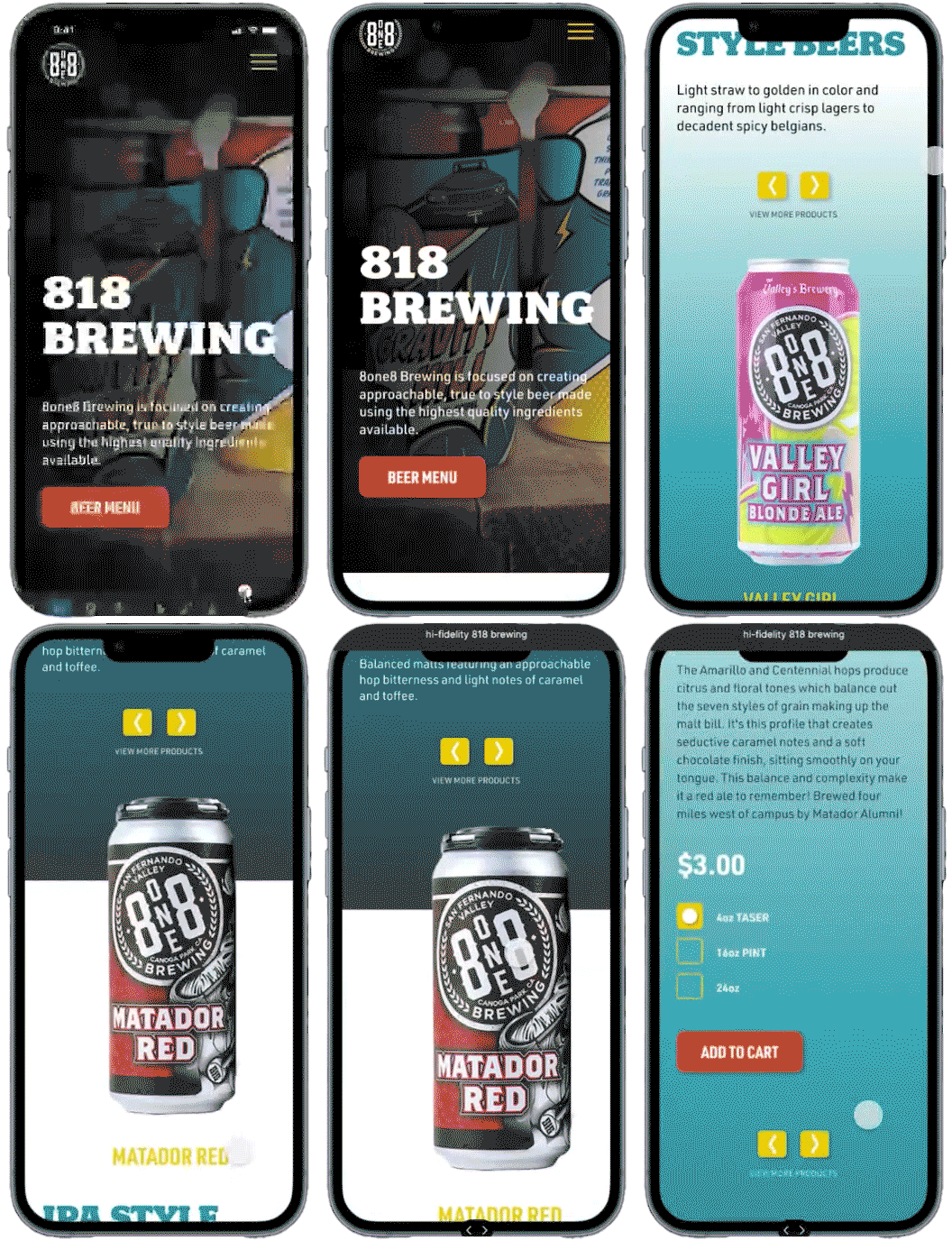
HIGH-FIDELITY WIREFRAMES.
In atomic design methodology, pages are designed as a hierarchy of atoms, molecules, and organisms.

MENU
The user has the ability to see the beers offered from each beer category.

CHECKOUT
The user can purchase the items by login in, checkout as a guest, or by creating an account.

PRODUCT
The user can read about the product and is able to add the product to the cart.

SHOPPING
This screen allows the user to enter the shipping information.

CART
The user has the ability to see all the products and the total amount of the products that want to purchase.

THANK YOU SCREEN
This screen gives a summary and order information.


